Logo of SpinX on a dark background, with abstract playing card shapes in grayscale on one side.

Building a brand for a poker coaching startup

Building a brand for a poker coaching startup

Building a brand for a poker coaching startup

Created @

Created @

Created @

Project overview

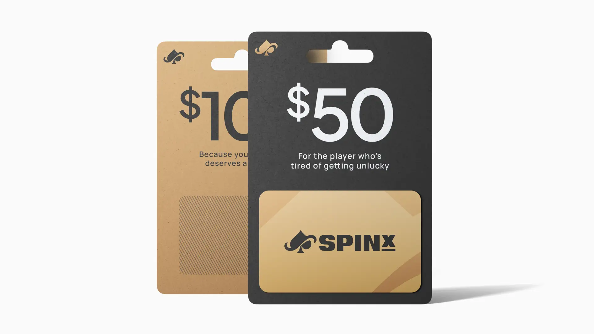
SpinX is a startup that focuses on coaching aspiring poker players how to succeed at winning a particular format called "spin and go." It’s a fast three-player poker format where a randomized prize pool multiplier creates quick games with the potential for big payouts. The team came to Visuals by Impulse looking for a brand identity that would set them apart from competitors and position SpinX as a new contender in the poker coaching space. With a tight timeline, we agreed to focus on a smaller initial scope by delivering a scalable logo, color system, typography, and early advertising concepts so the company could launch quickly and expand the brand at a later date.

Role

Designer

Date

2019

Team

John M.

Skills

Branding

Early logo concept of "SpinX" featuring bold yellow and white letters on a dark background.

Reworking the mark with clearer purpose and intent

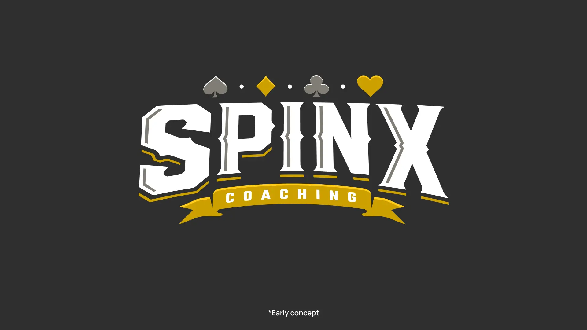
From the beginning, SpinX was adament about not using an identity that fell in line with their competitors. This mostly consisted of color schemes that relied on primary colors like red and blue along with overly detailed illustrations. For the first round of the project, the initial concept was to let the name of the brand be the main component of an emblem based composition. After reviewing the concept with the team, there were two points of feedback that were made apparent to us. The emblem based format and chosen typeface more resembled an event or tournament, rather than a premium coaching service. Also, it could be easily misread as "Spinx" rather than "Spin-X." However we needed to find a way to put emphasis on the X without styling it differently from the rest of the mark or using punctuation. With this feedback, it was agreed upon to simplify the logo into a design that combines a cleaner typeface along with a simple versatile brand mark that could stand on its own allowing the team more usage flexibility in their marketing channels.

Logo of SpinX featuring a stylized lion in gold on a black background and in white on a gray background.
Logo of "SpinX" featuring a stylized grid measurement elements against a dark background.
A sleek, stylized spade symbol outlined in gold appears on a dark background, merging a spade and spiraled line below. Minimalist and creative design.

Refining the visual language with premium cues

The "spin and go" style of poker is a fast paced format which includes lottery elements such as a winning prize pool multiplier. A gold color scheme was chosen for the icon to coincide with the feel of winning the pot or placing first place. Paired with a charcoal secondary color and a grainy texture, this gave the brand a more premium, classy feel. Since the name of the brand is on the short side, a wider and bold typeface was chosen to reflect the solid foundation the instructors will help their customers add to their playstyle.

A color palette featuring five squares: gold, bronze, white, gray, and black, each labeled with their color names.
Comparison image of two fonts: "Plus Jakarta Sans" on the left and "Manrope" on the right. Both display the full alphabet, numbers, and special characters, followed by font weight examples.
A white hoodie with a black SpinX logo and a black polo shirt with the gold and white "SpinX" logo
Black and gold cap with "SpinX" logo, paired with matching business cards. The setup conveys a modern, professional brand identity.
A black and beige lanyard on a dark surface features a repeating pattern of card suits and the "SpinX" logo in white. It has a metal clasp.
Two gift cards, one black and one gold, with values of $50 and $100. They read "For the player who's tired of getting unlucky" and "Because you deserve a break."
Gold and white "SpinX" logo next to poker chips on a blurred desaturated background, conveying a sleek, gambling-themed aesthetic.

Finding clarity in an unexpected ending

After presenting two rounds of concepts, communication with the client became inconsistent and the project was eventually cancelled before moving into the next stage of refinement. While the engagement ended prematurely, the process produced a strong visual direction showcasing how the brand could live in the real world and clarified how it could evolve over time. Even though the project didn’t reach its final stages, it offered valuable insight into alignment, expectation-setting, and pacing - important reminders that not every project sees the finish line, even when the work is strong. These lessons continue to shape how I approach early-phase branding engagements today.

After presenting two rounds of concepts, communication with the client became inconsistent and the project was eventually cancelled before moving into the next stage of refinement. While the engagement ended prematurely, the process produced a strong visual direction showcasing how the brand could live in the real world and clarified how it could evolve over time. Even though the project didn’t reach its final stages, it offered valuable insight into alignment, expectation-setting, and pacing - important reminders that not every project sees the finish line, even when the work is strong. These lessons continue to shape how I approach early-phase branding engagements today.

Credits

Project Management

John M.

  • 8

    years of experience

  • 100%

    invested in the details

  • 1

    eye of the tiger

Seeking new role

Back to top

Small details.

Big impact.

© 2025 Tom Hayes. All rights reserved.

Designed and built with ♥

00:00:00
  • 8

    years of experience

  • 100%

    invested in the details

  • 1

    eye of the tiger

Seeking new role

Back to top

Small details.

Big impact.

© 2025 Tom Hayes. All rights reserved.

Designed and built with ♥

00:00:00
  • 8

    years of experience

  • 100%

    invested in the details

  • 1

    eye of the tiger

Seeking new role

Back to top

Small details.

Big impact.

© 2025 Tom Hayes.

Designed and built with ♥

00:00:00