" width="26.999999869204867px"><path d="M 20.461 24.779 L 15.683 15.268 C 15.602 15.911 15.467 16.554 15.226 17.143 C 15.003 17.735 14.716 18.3 14.368 18.829 L 16.302 22.686 L 5.319 18.105 C 4.253 17.658 3.418 16.796 3.01 15.72 C 2.606 14.62 2.66 13.443 3.198 12.424 L 7.172 4.465 L 11.147 12.397 C 11.658 13.442 11.738 14.62 11.335 15.694 C 10.661 17.528 9.083 18.061 8.972 18.105 L 12.059 19.39 C 12.893 18.638 13.536 17.701 13.937 16.656 C 14.609 14.854 14.503 12.857 13.643 11.137 L 8.407 0.777 C 8.188 0.297 7.703 -0.008 7.172 0 C 6.642 -0.007 6.157 0.298 5.938 0.777 L 0.731 11.169 C -0.127 12.891 -0.234 14.887 0.435 16.689 C 1.11 18.485 2.498 19.927 4.274 20.68 L 18.688 26.707 C 18.857 26.784 19.041 26.82 19.226 26.815 C 19.603 26.815 19.98 26.652 20.246 26.385 C 20.619 25.933 20.702 25.311 20.461 24.778 Z" fill="rgb(255, 255, 255)" height="26.815174125084088px" id="Lqqyh0dvy" transform="translate(6.403 0)" width="20.59735952649246px"/><path d="M 8.338 5.704 L 4.309 7.39 L 6.242 3.561 C 5.892 3.033 5.605 2.467 5.384 1.874 C 5.169 1.266 5.017 0.638 4.929 0 L 0.148 9.48 C -0.111 9.992 -0.025 10.61 0.365 11.033 C 0.628 11.313 0.998 11.469 1.383 11.461 C 1.569 11.467 1.753 11.43 1.921 11.354 L 11.612 7.31 L 9.947 6.614 C 9.372 6.384 8.83 6.078 8.338 5.704 Z" fill="rgb(255, 255, 255)" height="11.461969375610348px" id="Hs6HfgIFx" transform="translate(0 15.538)" width="11.611941030493796px"/></g></svg>)
Project overview
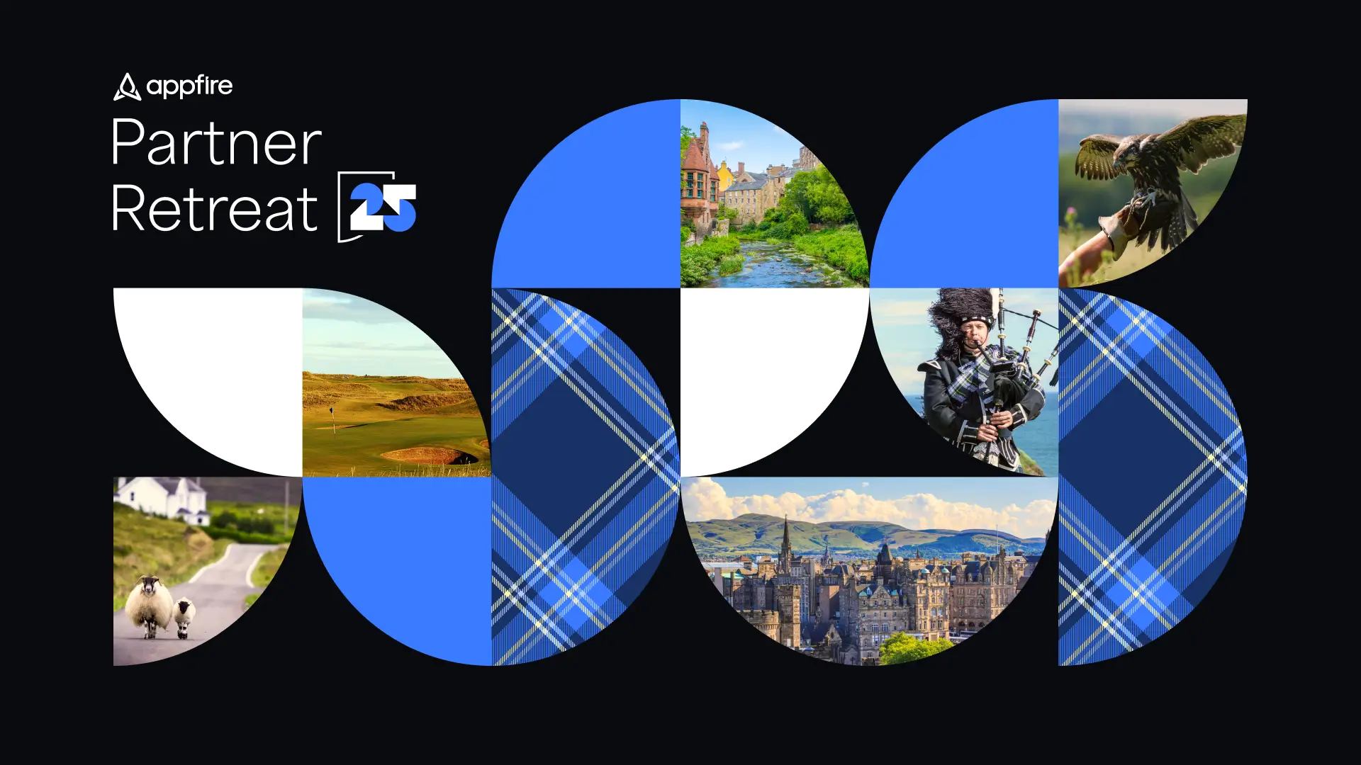
Designed to energize and motivate Appfire’s lower-tier partners, this campaign brought together strategy, storytelling, and timely creative direction. I led the design and art direction, building a fully on-brand system rooted in the Appfire design language while introducing an Olympics-inspired visual approach and messaging to coincide with the real event happening at the time. This thematic foundation helped create a sense of momentum, ultimately driving meaningful participation across the partner ecosystem. The campaign exceeded Q3 2024 engagement goals by 10% and generated 30+ net new contacts who previously had little to no contact with Appfire.
Role
Lead Designer
Date
2024
Team
Anna P.
Melissa H.
Robin G.
Skills
Art Direction
Illustration
Web Design

Driving engagement through a weekly system
To encourage participation from lower-tier partners, the campaign was designed as a multi-week engagement program built around a simple but motivating premise: complete weekly activities, earn points, and unlock rewards. Each week, a new task to complete was revealed, giving partners a reason to return and keep momentum steady throughout the campaign's run. To guide partners through the experience, supporting touch points were created across multiple channels, including targeted Google ads and weekly email announcements that drove traffic back to the landing page. The final deliverables included a centralized landing page to act as the campaign hub, weekly email communications, Google ad sets, and custom swag items tied to point-based prize tiers. Together, these components formed a cohesive system that made the campaign easy to follow and engaging from start to finish.


Balancing consistency with competitive energy
Crafting the visual direction meant balancing Appfire’s established brand system with the competitive energy of an Olympics-inspired campaign. The experience needed to feel distinctly on-brand while introducing a sense of momentum and friendly rivalry. Each week was given its own unique illustration, with activity point values incorporated directly into the visual using Olympic medals. By extension, the same illustration was used both the weekly email and the corresponding landing page section creating a seamless, recognizable experience as users moved between touch points. Another key challenge was ensuring the entire system worked across both dark and light mode, an essential requirement of the Appfire brand. Every asset, was designed with flexibility in mind in order to maintain contrast, clarity, and consistency across both environments. This added complexity to the design process, but ultimately resulted in a Olympics inspired campaign that felt fully aligned with the core Appfire brand.


Delivering on lasting Partner engagement
Credits
Hero Illustration and Sticker Design
Anna P.
Sr., Channel Marketing
Melissa H.
Director, Channel Marketing
Robin G.