" width="26.999999869204867px"><path d="M 20.461 24.779 L 15.683 15.268 C 15.602 15.911 15.467 16.554 15.226 17.143 C 15.003 17.735 14.716 18.3 14.368 18.829 L 16.302 22.686 L 5.319 18.105 C 4.253 17.658 3.418 16.796 3.01 15.72 C 2.606 14.62 2.66 13.443 3.198 12.424 L 7.172 4.465 L 11.147 12.397 C 11.658 13.442 11.738 14.62 11.335 15.694 C 10.661 17.528 9.083 18.061 8.972 18.105 L 12.059 19.39 C 12.893 18.638 13.536 17.701 13.937 16.656 C 14.609 14.854 14.503 12.857 13.643 11.137 L 8.407 0.777 C 8.188 0.297 7.703 -0.008 7.172 0 C 6.642 -0.007 6.157 0.298 5.938 0.777 L 0.731 11.169 C -0.127 12.891 -0.234 14.887 0.435 16.689 C 1.11 18.485 2.498 19.927 4.274 20.68 L 18.688 26.707 C 18.857 26.784 19.041 26.82 19.226 26.815 C 19.603 26.815 19.98 26.652 20.246 26.385 C 20.619 25.933 20.702 25.311 20.461 24.778 Z" fill="rgb(255, 255, 255)" height="26.815174125084088px" id="Lqqyh0dvy" transform="translate(6.403 0)" width="20.59735952649246px"/><path d="M 8.338 5.704 L 4.309 7.39 L 6.242 3.561 C 5.892 3.033 5.605 2.467 5.384 1.874 C 5.169 1.266 5.017 0.638 4.929 0 L 0.148 9.48 C -0.111 9.992 -0.025 10.61 0.365 11.033 C 0.628 11.313 0.998 11.469 1.383 11.461 C 1.569 11.467 1.753 11.43 1.921 11.354 L 11.612 7.31 L 9.947 6.614 C 9.372 6.384 8.83 6.078 8.338 5.704 Z" fill="rgb(255, 255, 255)" height="11.461969375610348px" id="Hs6HfgIFx" transform="translate(0 15.538)" width="11.611941030493796px"/></g></svg>)
Project overview
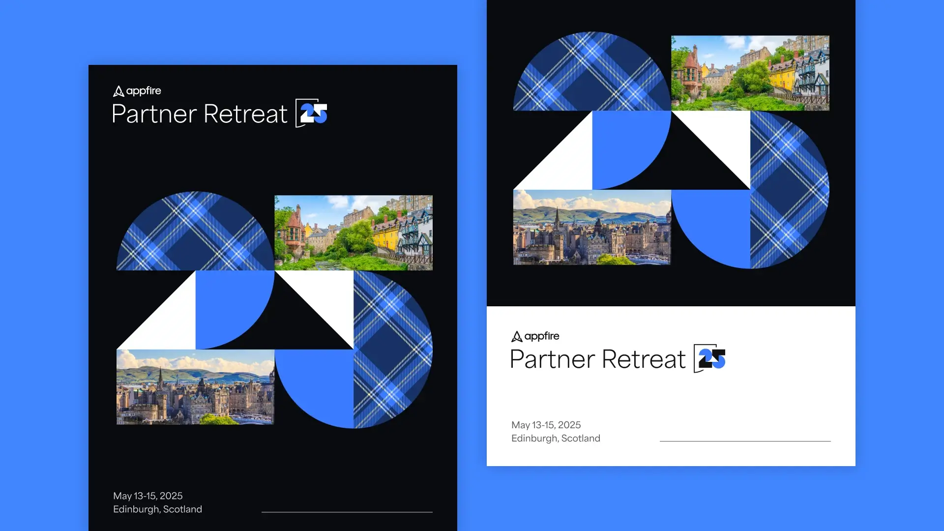
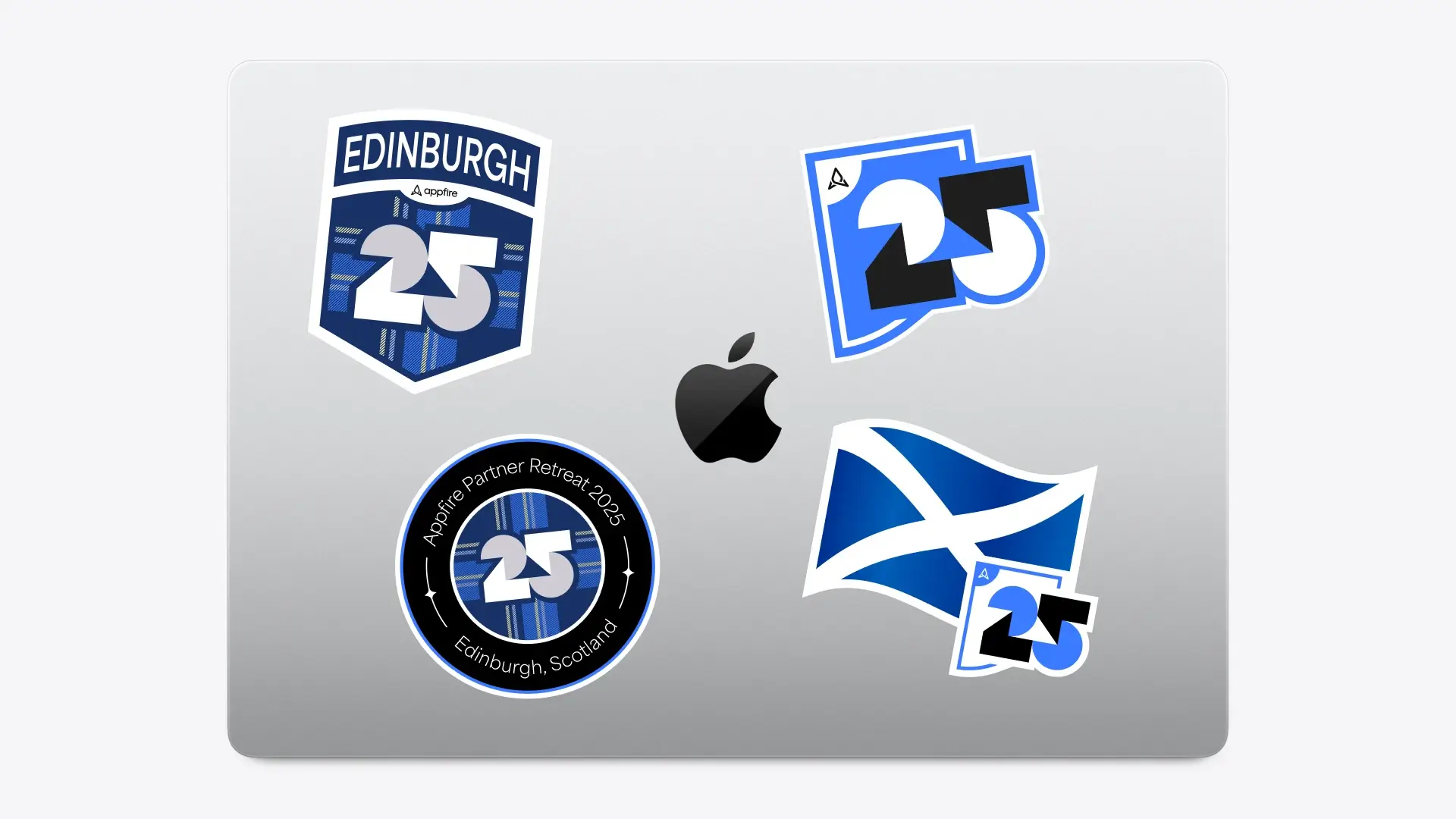
For my third consecutive year leading design for Appfire’s Partner Retreat, the focus was on crafting a refined event identity that felt both premium and deeply connected to Appfire’s core brand. Working within a condensed timeline, a comprehensive visual system was designed to scale across every touchpoint of the event. This included a custom event logo, a photography library, email headers, a curated sticker set, and a tailored slide deck template ensuring a cohesive, elevated experience from initial communications through all the materials used throughout the event.
Role
Lead Designer
Date
2023-2024
Team
Beth S.
Michele K.
Jess O.
Keira G.
Robin G.
Skills
Art Direction
Event Design


Shifting to a flexible identity system
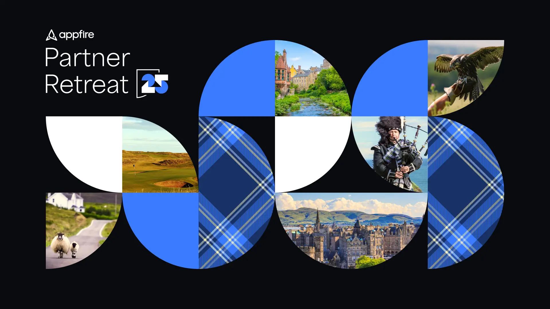
In order to support this new vision, the creative strategy evolved beyond standalone themes toward a more scalable and repeatable system. An early design direction provided a strong foundation, allowing us to refine and expand it into a flexible identity framework rather than starting from scratch. This approach moved the retreat away from using highly specific themes used in prior years, such as James Bond (2022) and Outer Space (2023), to a solution that emphasized consistency, adaptability, and longevity. The resulting system balanced brand alignment with flexibility, making it easy to introduce subtle venue-specific details like color and pattern, which became particularly meaningful for the 2025 retreat in Scotland.


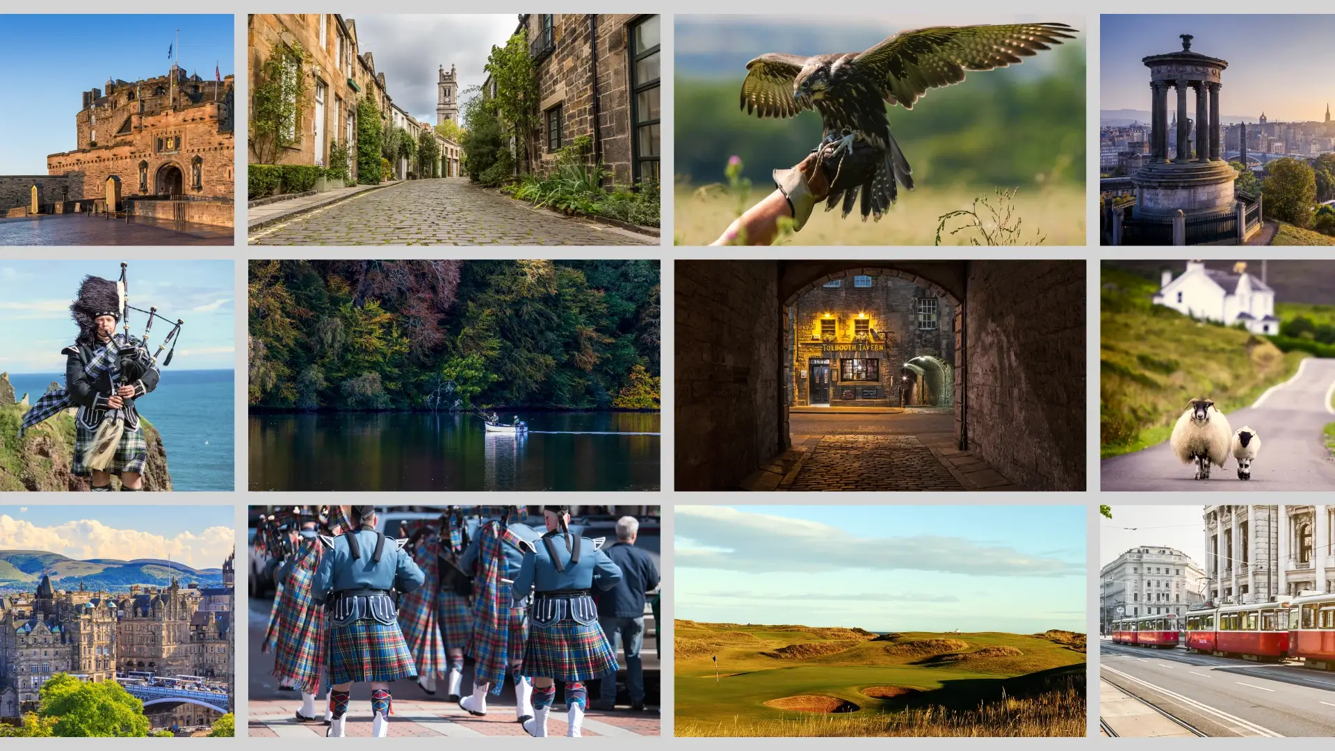
Anchoring the event in the spirit of Scotland
For 2025, the retreat took place in Scotland so we were able to incorporate subtle visual cues from the region into the final deliverables. Elements like blue and white from the national palette, traditional kilt patterns, and landscape photography helped ground the identity in the location without overwhelming it. These touches served as the “customization layer” within the broader framework, allowing the event to feel connected to its venue while still reading as a premium extension of Appfire’s core brand. The result was a system that balanced local character with brand consistency: distinct for Scotland, but fully aligned with the long-term event identity. We also moved forward with the idea of adding a geometric number of the year instead of using our standard brand font enabling some of that local character to be directly injected into the event logo as well as the other deliverables.


A framework built to grow with future retreats
Credits
Creative Refinement
Beth S.
Copywriting
Michele K.
GTM Strategy & Ops
Jess O.
Event Management
Keira G.
Director, Channel Marketing
Robin G.