Project overview
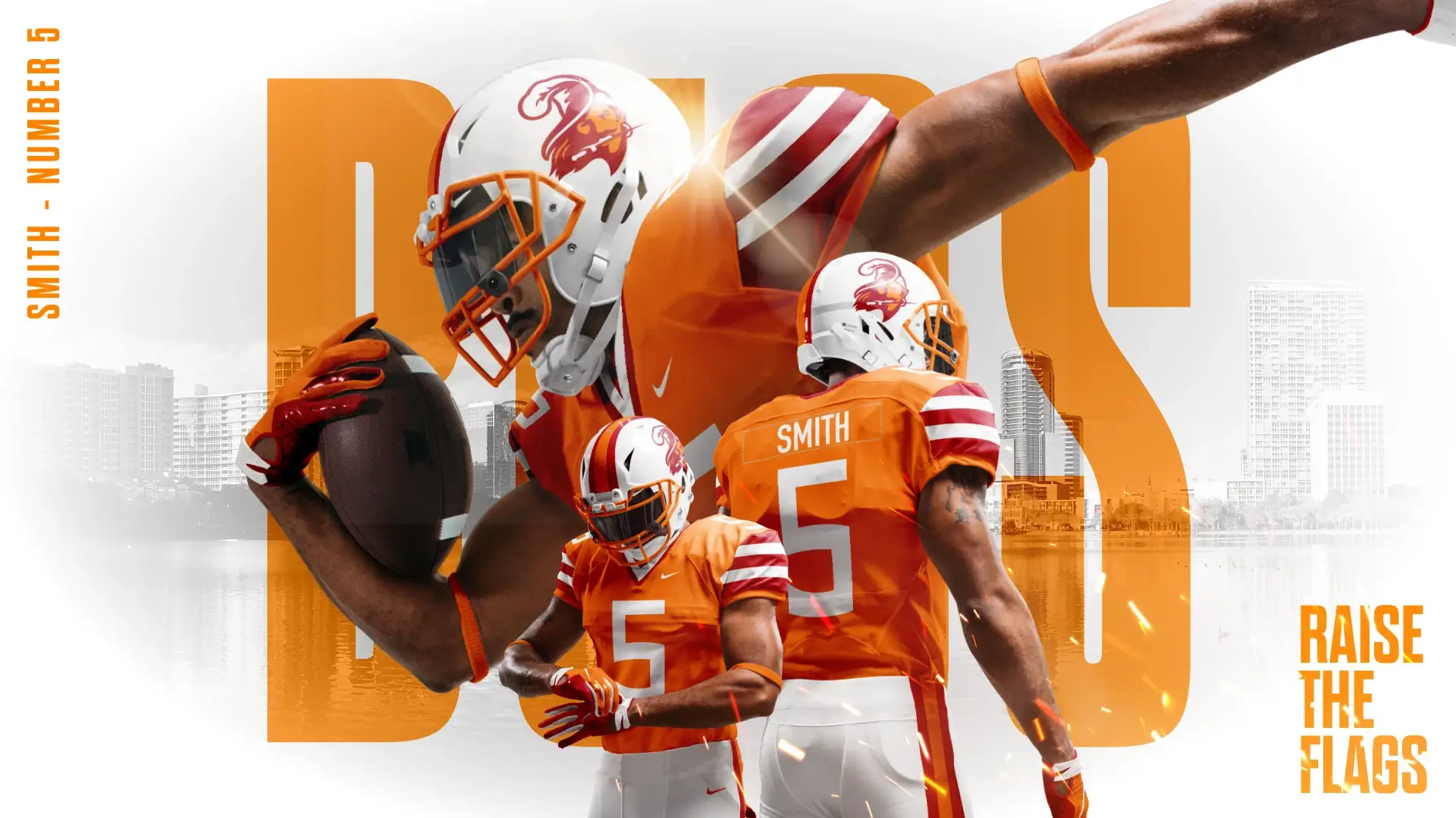
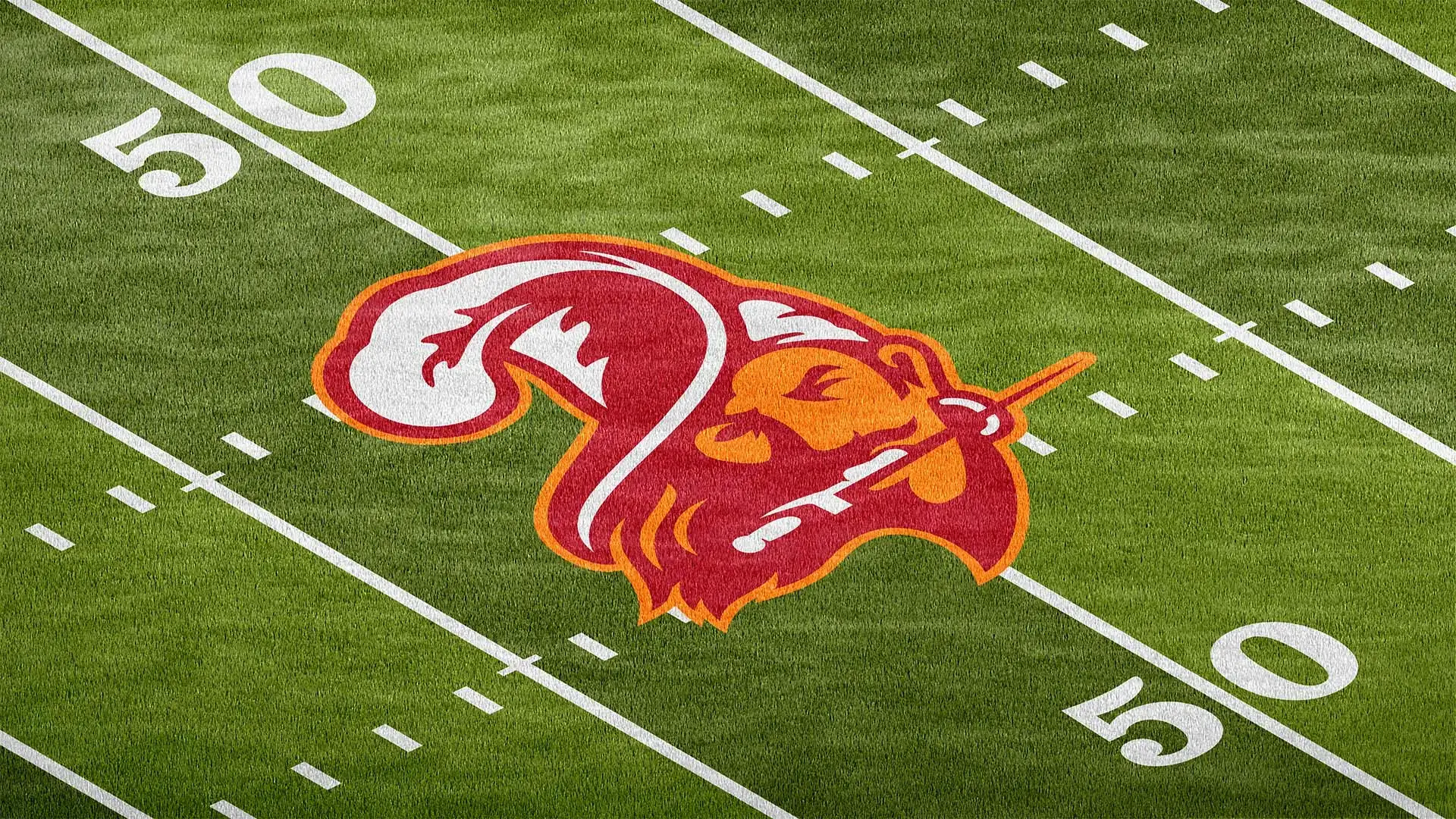
Bucco Bruce is one of the most iconic marks in NFL history - a symbol with a cult-level following and decades of nostalgia among Buccaneers fans. For many, it represents a distinct era of the franchise, and its charm has only grown with time. As a big football fan myself, this project began simply for fun: a personal challenge to imagine what a refreshed version of this logo could look like today. Many NFL franchises have successfully done this over the years and I wanted to see if I could do the same. The goal was to keep the swagger and personality of the original while updating it for a more modern era.
Role
Designer
Date
2025
Skills
Illustration
Branding


Enhancing a retro look with a modern touch
To modernize such a beloved mark, I focused on understanding what made the original Bucco Bruce so memorable. The charm was in the confident expression, the flowing hat, and the unmistakable swagger. From there, the goal was to refine the silhouette, simplify the line work, and create a mark that would translate well across today’s digital and print environments. This meant tightening proportions, clarifying shapes, and reducing unnecessary detail while protecting the personality that fans connect with. Every decision was made to ensure the new version still felt undeniably “Bruce,” just with a sharper, cleaner presence that would comfortably sit alongside today's NFL lineup.