" width="26.999999869204867px"><path d="M 20.461 24.779 L 15.683 15.268 C 15.602 15.911 15.467 16.554 15.226 17.143 C 15.003 17.735 14.716 18.3 14.368 18.829 L 16.302 22.686 L 5.319 18.105 C 4.253 17.658 3.418 16.796 3.01 15.72 C 2.606 14.62 2.66 13.443 3.198 12.424 L 7.172 4.465 L 11.147 12.397 C 11.658 13.442 11.738 14.62 11.335 15.694 C 10.661 17.528 9.083 18.061 8.972 18.105 L 12.059 19.39 C 12.893 18.638 13.536 17.701 13.937 16.656 C 14.609 14.854 14.503 12.857 13.643 11.137 L 8.407 0.777 C 8.188 0.297 7.703 -0.008 7.172 0 C 6.642 -0.007 6.157 0.298 5.938 0.777 L 0.731 11.169 C -0.127 12.891 -0.234 14.887 0.435 16.689 C 1.11 18.485 2.498 19.927 4.274 20.68 L 18.688 26.707 C 18.857 26.784 19.041 26.82 19.226 26.815 C 19.603 26.815 19.98 26.652 20.246 26.385 C 20.619 25.933 20.702 25.311 20.461 24.778 Z" fill="rgb(255, 255, 255)" height="26.815174125084088px" id="Lqqyh0dvy" transform="translate(6.403 0)" width="20.59735952649246px"/><path d="M 8.338 5.704 L 4.309 7.39 L 6.242 3.561 C 5.892 3.033 5.605 2.467 5.384 1.874 C 5.169 1.266 5.017 0.638 4.929 0 L 0.148 9.48 C -0.111 9.992 -0.025 10.61 0.365 11.033 C 0.628 11.313 0.998 11.469 1.383 11.461 C 1.569 11.467 1.753 11.43 1.921 11.354 L 11.612 7.31 L 9.947 6.614 C 9.372 6.384 8.83 6.078 8.338 5.704 Z" fill="rgb(255, 255, 255)" height="11.461969375610348px" id="Hs6HfgIFx" transform="translate(0 15.538)" width="11.611941030493796px"/></g></svg>)
Project overview
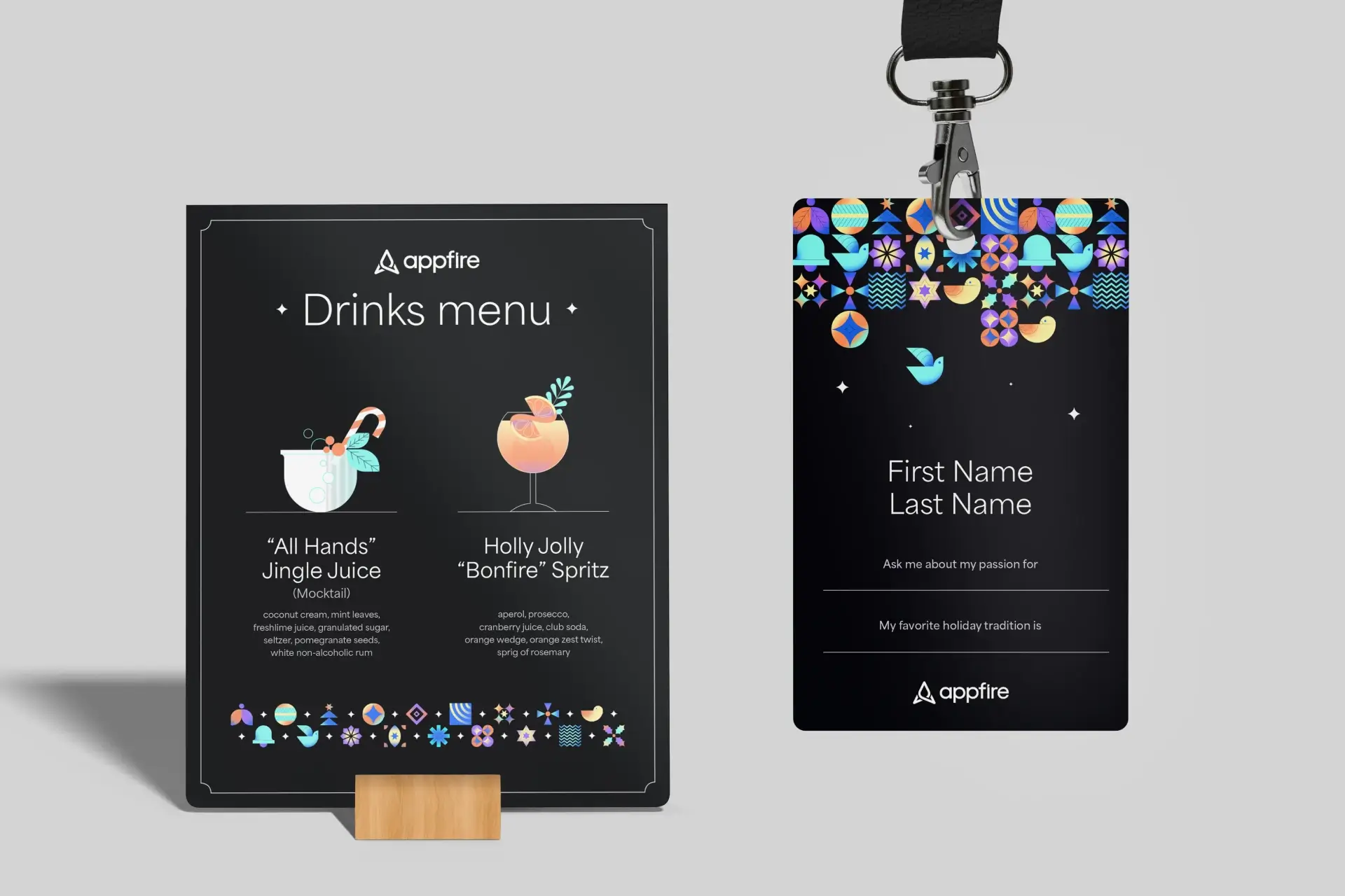
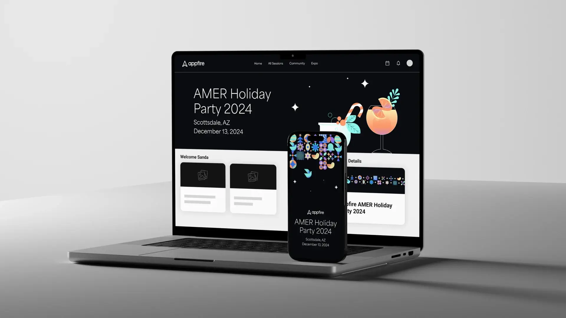
As lead designer for Appfire’s global Holiday Party, I was tasked to develop a cohesive visual system that needed to work across three regions - meaning it couldn’t lean into any single holiday or cultural reference. The direction needed to feel festive while still remaining rooted in the core Appfire brand, functioning as a playful offshoot rather than a standalone identity. During the exploration phase, I directed the additional designers on the Creative Services team, guiding early concepts to ensure the system remained unified and scalable. Once the creative direction was set, I partnered closely with the Events team to coordinate all print materials and approve proofs across each venue. This included signage, drink menus, region-specific photo-booth strips, ID badges, and custom swag items for the attendees. The resulting visual package brought consistency, clarity, and celebration to an event experienced simultaneously around the world.
Role
Lead Designer
Date
2024
Team
Anna P.
Sonia S.
Sanda G.
Skills
Art Direction
Illustration
Event Design

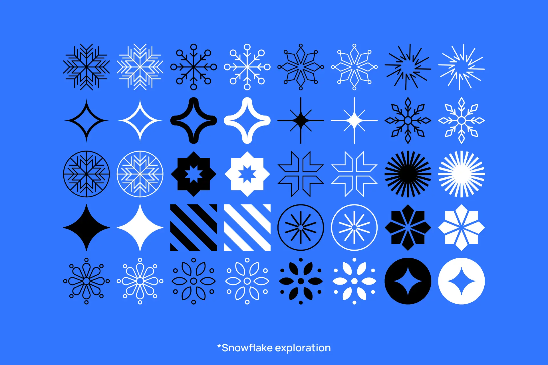


Establishing a scalable pattern language
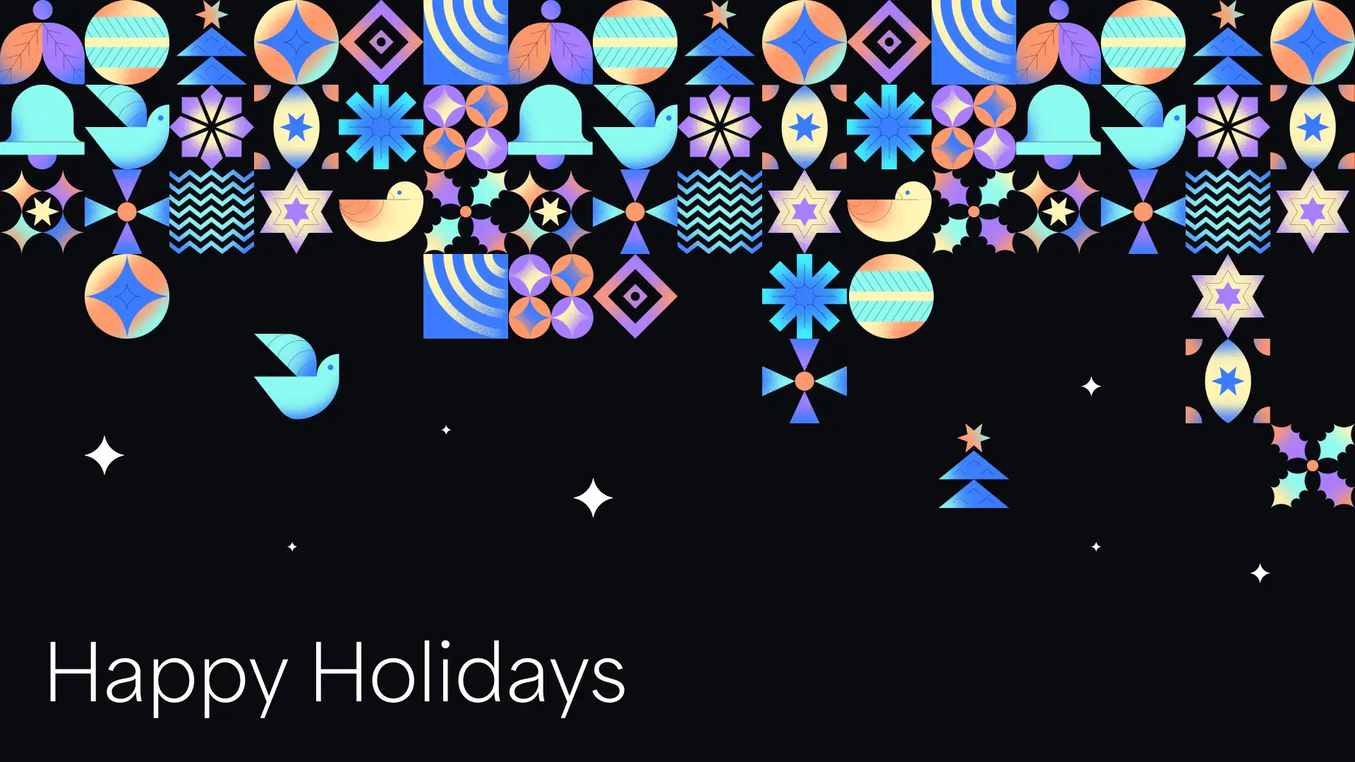
After exploring several creative directions, we ultimately moved forward with a Bauhaus-inspired pattern system that offered both clarity and flexibility. By breaking the visuals into simple geometric “holiday tiles,” we could nod to multiple celebrations without centering on any single one - a key requirement for a global celebration. Using Appfire’s core brand colors ensured everything felt cohesive and unmistakably on-brand, even as the tiles referenced different seasonal motifs and patterns. Because each tile was modular, the system became infinitely scalable. The patterns could be rearranged, expanded, or remixed to fit any asset, from signage to menus to swag, while maintaining a consistent visual language across every region the event took place in.

Navigating global production challenges
Executing this system across three regions came with its own set of challenges. Every print material was produced locally in the region where it would be used, meaning each asset required both imperial and metric versions. This meant that we worked with multiple vendors across the globe, each with their own print specifications, file requirements, and proofing processes. We also had several hundred name tags to prepare, all requiring accurate localization to ensure names and languages printed correctly. To keep everything consistent, I partnered closely with the Events team throughout production, reviewing proofs, clarifying requirements, and confirming details for each region and vendor. This level of coordination ensured that no matter where the materials were printed or who printed them, they aligned perfectly with the visual system and met the quality bar for the event.


Delivering a unified holiday experience
Credits
Design exploration
Anna P.
Menu illustration
Sonia S.
Events team
Sanda G.